Saltar al contenido

Ritec Web

UX DESIGN / WEB DESIGN/ VISUAL DESIGN 

Role:

Lead UX Designer 

at agency Playroom360

Project goal:

Create a website for the company Ritec, a company in the agricultural sector specialized in irrigation, focused on naturalness, technology and ecology, which breathes freshness and shows why they are one of the leaders in their sector.

Target audience:

Professional farmers and businessmen dedicated to the agricultural exploitation sector between 30 and 70 years old.

Research:

I did brainstorming sessions and multiple sessions with the client to understand exactly what they were looking for and how to approach it. Perfectly understanding the profile of the average user, their needs and at the same time the needs of the company itself.

Initial design concepts:

Fresh and ecological design. Very minimal and trendy.
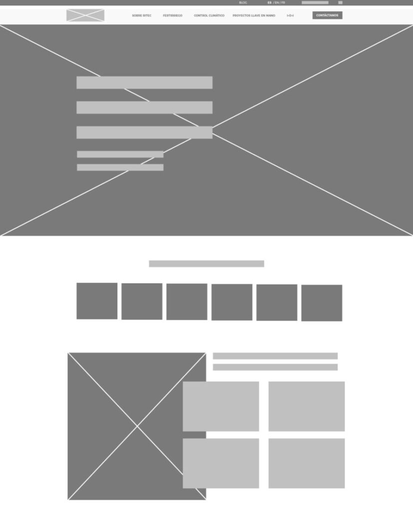
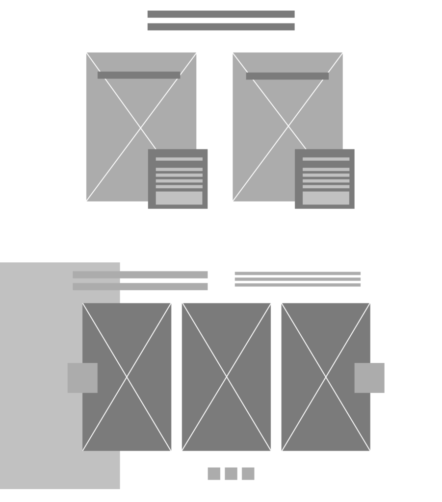
Some Wireframes:

Usability findings:

These were the main findings uncovered by the usability studio:

  • Scroll: Many users do not scroll, so we analyzed the need to condense the content as much as possible.
  • Color Hierarchy: The use of yellow for buttons and other prominent elements played an important role in decision making. I experimented with games of blue, but finally I showed that the touch of a high contrast color like yellow, emphasized the click on the user.
  • Nature: Showing natural elements like leaves moving across the screen in subtle ways made a positive impact.

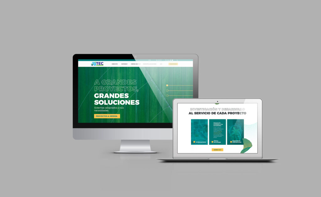
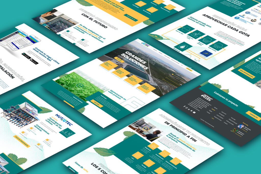
Mockup Web: